McCoy’s
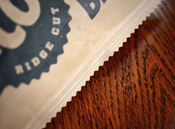
We gave McCoy's Crisps a manly makeover to align the packaging more with their brand message "MAN CRISPS". By turning the pack on its side, we've maintained the same dimensions, but allow even big, chunky builder hands to fit inside with ease. What started as a ‘manly’ design ended up being a design that’s better for everyone.
Rebrand • Packaging design

“A once-in-a-lifetime-holy-sh*t improvement”
Dominique Zamora, Foodbeast


• Over 200,000 views online in 7 days
• Over 60,000 views on Buzzfeed
• Awarded Pack of the Week on The Dieline
• Featured on Creative Review design blog
• Featured on FoodBeast design blog
• Featured on DesignWeek design blog
• Featured on Thrillist design blog
• Featured on The Drum